
Good use of visual design can help provide clarity and engagement in the resources you create online.
Some simple rules to remember when creating materials are:
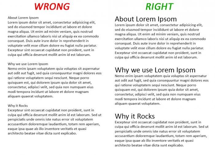
Text Size: Use size to define headings from paragraph text. This can express importance, create visual interest or attract attention. Good use of text size allows the reader to navigate around the page.
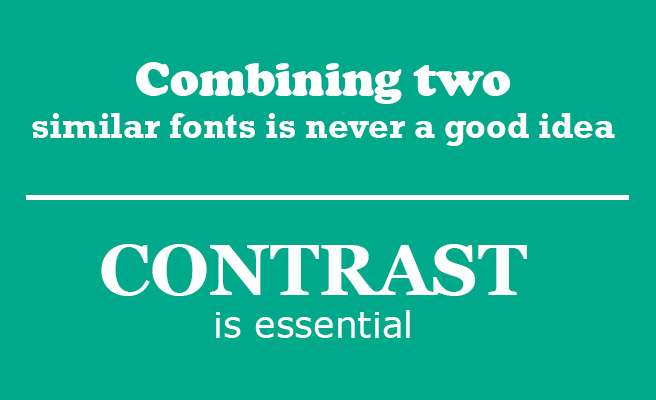
Contrasting fonts: There is a science to finding complementary fonts, fonts can provide a message and feel of the document being read. The easiest way to contrast the fonts is by using serif with sans-serif fonts or Regular with italics. This idea of contrast brings together multiple concepts that you should be considering, including hierarchy and how fonts complement each other.
In the example below, a bold, chunky serif font is paired with a thin sans serif one — and although they’re almost complete opposites, they work nicely together in large part because they are so different. The differences help create distinct roles for each font, allowing them to stand out as individual pieces of information.
Colour: Use of colour can also help define headings, generate emotions and create visual interest. Some colours are warm and active (Orange, Red) whilst some are cool and passive (Blue, Purple).
Using a colour wheel can help create a good colour palette. Click here for the Adobe Colour wheel
Other ways of improving the visual appearance of the sites is the use of Banners and Images.
Banners
Banners appear at the top of the home page within a site. These are usually images that represent the theme of the module but may also include text. It is worth noting that the banner images are not accessible to disabled students, so do not include any text in the banner image other than the title of the module.
A banner size of 600px wide x 75px high is adequate.
Images
Images can be added to any description box and work well in content items to break up large blocks of text.
You must add a text description in the Image Description field. The description is for users of screen-reading software that cannot read text contained within images or describe images. The text description should represent what is contained in the image, especially any text elements.
For graphs and charts, the text description will need to present enough information for the student to undertake the activity. How much description and its content depends on the learning objective of the activity. If the focus is on the interpretation of the shape of the graph, the shape should be described. If the focus is on the trends of data, then data points could be described.
For information and guidance on accessible visual design in Course Resources, see our pages on Ally.